TonalButton
import { TonalButton } from "@material";export component Example inherits Window { width: 200px; height: 100px; background: transparent; TonalButton { text: "Tonal"; icon: @image-url("../icons/music_note.svg"); width: 120px; height: 40px; }}slint
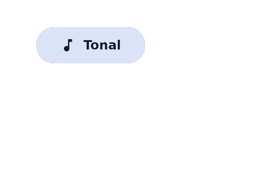
A TonalButton is a button with a secondary container background, used for less prominent actions than filled or elevated buttons.
Properties
Section titled “Properties”enabled
Section titled “enabled”bool default: true
Whether the button is enabled and can be interacted with.
image default: the empty image
An optional icon displayed on the button.
string default: ""
The text label displayed on the button.
tooltip
Section titled “tooltip”string default: ""
A tooltip text that appears when hovering over the button.
Callbacks
Section titled “Callbacks”clicked()
Section titled “clicked()”Invoked when the button is clicked.
© 2025 SixtyFPS GmbH